The importance of landing pages in clinical trial recruitment - and how to optimize yours for maximum impact
What is a landing page, and why is it important for clinical trial recruitment?
Your landing page is your handshake to each potential participant who comes to learn more about your trial. It’s your first chance to make a great impression and excite your new visitor; executed incorrectly, it is also your last chance.
Once upon a time, Steve Jobs stood in front of an auditorium of then-beleagured Apple employees. And as he began to unveil the Think Different ad campaign, he set the stage and the stakes:
"It’s a complicated and noisy world, and we’re not going to get a chance to get people to remember much about us. No company is. So we have to be really clear about what we want them to know about us."
That was way back in 1997. If the world was noisy then, it's only gotten noisier since. 21st century consumers now expect - and demand - 21st century experiences. This is no different when it comes to their healthcare. In the age of Lyft, Postmates, and Amazon, there is no reason why a clinical trial’s website should not be engaging, optimized, and easy to navigate.
The stakes are high. A poorly-optimized landing page will lead to low conversion-to-lead conversion rates, increasing the difficulty of the already-difficult process that is clinical trial recruitment. On the other hand, a properly optimized landing page will lower your costs at each step of your funnel, thereby maximizing each dollar you spend and every ounce of your team’s effort you expend in recruitment efforts.
Key takeaways
- A landing page is the first chance to excite a would-be participant into taking next steps. Done poorly, it is also the last chance.
- Optimize copy with understandable language and avoid getting your message bogged down in details too early.
- Identify your most important conversion action and limit your landing page to one call-to-action.
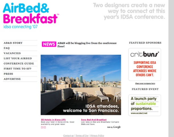
What we can learn from Airbnb
Airbnb is a hulking behemoth of a company now. Valued at $31B, they are a long way from their humble roots of renting out the founders' air mattress in a cramped San Francisco apartment.
Good news is that we have access to their first-ever landing page! Back in 2007, the idea of staying in some stranger's home was as exotic an idea as clinical trial participation is in the mainstream today. We can learn a ton about how to design for trust, how to optimize for conversions, and more just by looking at this relatively barebones page that launched Airbnb as a company.
In this guide, we'll just go through the first-ever Airbnb page. If you'd like to see other breakdowns of landing pages from companies such as Uber, IBM, and of course Airbnb, you can read more here.
How'd they do it?
A few things stick out here.
One is that the page, even back then, optimized for that one action: Booking.
In this case, it was even more specific an action: Booking an air mattress in the founders' apartment for folks traveling to San Francisco to attend the Industrial Designers Society of America's 2007 conference.
Everything on the page is designed to help a conference attendee decide to stay on a couple of strangers' air mattress. The headline of the page specifically mentions the IDSA conference; in fact, the conference is mentioned multiple times above the fold.
But the team knew that staying in a stranger's home was too new a concept for almost everyone. One can see the way they tried to address the newness of their business model by designing for trust (tactic 5).
For instance, the landing page spends significant space to feature a sponsor (thereby establishing social proof for the just-born company. They even display a Featured Event, which helps the site appear more significantly tied to the conference, without having to have the event be an official sponsor of the page.
And of course, the team worked the easy, more traditional angles, too. They feature an FAQ on the sidebar, as well as their founding story ("Airbnb Story") and a link to their early press (more social proof).
The parallel to the world of recruitment is quite obvious in this case. In the same way a clinical trial is still an exotic concept in the mainstream, so too was the concept of sleeping in someone's living room whilst visiting a city for a conference.
Airbnb had a lot of important information that needed to get conveyed to convert anyone to a booking. And yet, the landing page remained remarkably concise and, as a result, the message and core conversion action were left unambiguous to any visitor. All they needed was to get some small segment of their website visits to convert into a lead...just as we in clinical trials need just a small sliver of a conversion rate from visit to lead to make our recruitment funnel work.
And the team behind this first Airbnb page had the wisdom to know that there was little chance of conveying all they needed to convey to get a visitor engaged. It would take too long, require too many words and pictures; the visitor would almost certainly drop off if Airbnb tried to plead its case in full right at the top of the page.
So, they relied on social proof to quickly dismiss some early concerns. And the same concept holds true for recruitment: It's been our experience time and time again that a million science-y words and a thousand cool facts about research have just a fraction of convincing power as that of a patient vouching for your team or research.
If there is any opportunity for you to use social proof within your page - from a patient who lives with the condition you are studying, or from someone on your team who can vouch for the safety of the treatment, or a quote from press - use it, and put a face to the quote if at all possible. After all, th visitors to your landing page are going to be motivated folks living with some medical condition - or motivated folks who act as caretakers for those living with the condition - who do not have a lot of time or patience for medical jargon. Provide them with some social proof of your work, and they will feel much more comfortable, much quicker than they would have after reading a long scientific journal entry about your research.
Landing page optimization tactics
As we discussed earlier, a landing page is your handshake and your first chance to engage your new audience. As of 2017, an average visitor to a website will only stick around for fewer than 59 seconds. The reality is stark: No one in this day and age has the luxury of time to engage an audience. Consequently, your greeting needs to be perfectly honed, or you will fail to turn your new visitors into a cohort of interest, motivated, and exciting leads for your study.
Here are the tactics we focus on at Clara to ensure every landing page we create for a trial is as engaging as possible:
1. Be an editor, not a campfire storyteller.
There’s a lot to tell someone who wants to know about your trial. There’s the history of your treatment’s development, the many benefits it could yield, the cool science behind how it all works… But it is paramount that you do not inundate a visitor with all this information at the top of your landing page.
Resist the temptation to dive too far into details immediately. Pick one message that you believe will be most impactful - a good rule of thumb in landing page copywriting is that, if you find yourself using the word “and” multiple times to extend a sentence, your text is not engaging enough.
In other words, do not drone on and on like a campfire storyteller seeking to wring one more minute of intrigue from your audience. Be, instead, an editor, who knows exactly which story points matter, which do not matter as much, and be disciplined in the telling of your trial’s story. This focus will create intrigue and excitement, which both translate into visitors who are willing to spend more time investigating what other stories you have to tell.
2. Provide one call-to-action on the page.
In the same editorial spirit, find the one action that you want your visitors to take, and ruthlessly remove any and all extraneous elements from your landing page.
If you have both a contact capture form and a pre-screener survey and a button that leads to supplemental text within the first 50% of your page, figure out which of the three are the most important to your recruitment efforts and cut the rest. It's like the old coaching saying goes: If you have two quarterbacks, you have none.
So, do not mistake the provision of multiple options as patient-friendly; it is in fact the opposite. Multiple elements confuse a visitor’s attention and lead immediately and invariably to drop-off. By focusing all of the visitor’s attention to the one call-to-action, however, you will maximize your chances at converting the visitor into a lead or pre-screened participant.
3. Life happens above the fold.
An old term from the world of journalism, the "fold" refers to that crease that folds a newspaper in half. Since the early days of print, editors have fixated on placing the most interesting, engaging content at their disposals above that fold; it was the only way to get someone to stop, consider the headlines, and hopefully purchase a copy.
Every landing page also has a "fold" - in this case, it's the line that divides the page into the portion that can be seen without scrolling. Visitors to any webpage will only scroll if the above the fold experience is engaging. So, it's our job to ensure that our honed copy from step 1 and our focused call-to-action from step 2 are displayed above the fold.
In trying out this exercise, it's likely that you find that your copy is too long, or that your call-to-action doesn't fit well with the messaging you're using to greet your visitors. That's completely normal! Designing a great above the fold experience is all about concision and editing; as you and your team work to hone your message down to its most essential components, your chances at engaging and converting your cohorts will only get better.
4. Speak in the patient’s language.
You are immersed in your research, and you know all of the technical terms involved like the names of your aunts and uncles. However, a visitor who wants to learn more will more likely than not feel intimidated by the complex language so prevalent on most industry pages. More often than not, these visitors simply elect to close out of the confusing, jargon-flooded page.
The reason for this is quite simple: A person looking for clinical trials has a life outside of the condition they are seeking treatment for. They have social lives, romances, children, pets, jobs… And little time to also bone up on the latest industry jargon.
One of the cardinal rules of copywriting is meeting an audience on their own terms, in their own words. While it may feel to a seasoned researcher as though they are not speaking down to an audience by reforming copy in everyday language, the inverse is true. By adopting the language that the audience feels most comfortable with, the material is in fact made more respectful. And by optimizing for this respect factor, you will in turn maximize your ability to recruit.
5. Design for trust.
Imagine you are shopping for a family car and you walk into a shabby dealership with peeling paint and the smell of some cigarette butts wafting in from the background. Would you feel comfortable buying the minivan that will carry your spouse and children from the fast-talking man in the sleazy suit at this dealership?
Probably not.
Admittedly, that is an extreme visual. But the same general principles hold true in the minds of patients as they consider their clinical trial options. Many of them are urgently seeking new treatment for a condition that is hampering their lives in some significant way. In these moments of anxiety, trust is the one element that will help them feel comfortable enough to take the next steps that can eventually enroll them in your trial.
Design for trust. Make sure the photographs you use are high-resolution. Use social proof, such as quotes from other patients, your research team, or an external party (such as a trusted publication). Ensure that you’ve taken every step possible to make a potential participant feel comfortable. Speak to their worries and you will unlock significant lifts in your team's ability to turn interest into action.
6. Optimize for mobile.
More than 50% of Clara’s traffic comes from either a tablet or smartphone, and that cohort of visitors tend to be our most engaged audience. This is a trend across the whole of the internet: More than 50% of all internet traffic is now mobile, and mobile traffic is twice as engaged as desktop traffic.
In other words, a site that is not well-optimized for mobile in 2018 is a site that will fail, more than half the time.
As with all things related to landing pages, the stakes could not be higher. To ensure that you are not losing otherwise qualified traffic to mobile woes-related issues, check your sites on a smartphone and on an iPad. Make sure that the elements like contact capture modules or pre-secreeners are showing up properly; that the text is legible (and large enough!) and well-formatted; and that every button works as expected and shows up where expected.
It can be the case that some templated landing pages used by vendors have issues in rendering in mobile - these templates will accidentally place images over buttons or move text boxes around and half out of view. Double check each landing page frequently to make sure performance on mobile devices are up to snuff.
For a third time, because it really is that important: Missing mobile means almost half of your audience will drop off. No recruitment effort can survive that sort of hit.
7. Optimize copy for different contexts.
Most clinical trials now supplement their traditional media buys with digital advertising. Digital advertising offers precision in tracking and in the targeting of ads. This relatively new precision unlocks another benefit: Separate landing pages that speak specifically to different audiences, who have all seen different prompts and messages.
For example, if a visitor is drawn in by a piece of content titled, “Brand new IBD treatment now in trials,” we can now elect to send them to a landing page that speaks specifically to the content they just saw - the headline for this landing page might read something along the lines of “Interested in a brand new IBD treatments?”
On the other hand, a portion of our traffic may be coming in from ads that speak to a specific symptom that people have searched, such as nodules under the skin. In this case, we may elect to point the traffic into a landing page that specifically calls out the symptom: “Concerned about your nodules and unsure of your diagnosis?”
By pointing different segments of traffic to pages that are tailored for the messaging they received, we are able to increase the conversion rate of each of the different pages more than we could by using just one general landing page.
At Clara, our platform allow for the quick creation of these variant pages, but it can be the case that your team or vendor may not be able to do so without incurring additional cost. We still recommend that any trial spins up at least two pages that can speak specifically to two of their biggest traffic sources.
Conclusion
Landing pages are the first chance you have to take interested cohorts and turn them into excited leads in your recruitment funnel. Optimizations here yield massive benefits down the road; missing on obvious optimizations at this step of your funnel will invariably lead to compounding frictions and costs as you move cohorts down your funnel.
The stakes are high, but the tactics are intuitive and easy enough to implement for any study team. By adopting the above best practices, any team can build better landing pages that act as warm and effective welcomes for their target audiences.