What we can learn about landing pages from Airbnb, Uber, and IBM
The tactics we use
Before diving in, let's outline the tactics that we use at Clara to design optimized and welcoming landing pages:
- Be an editor, and keep your messaging concise and punchy.
- Have one clear call-to-action. If you have two CTAs, you have zero.
- Life happens above the fold. Whittle your message down to its most essential form and put it where a visitor can see it without scrolling.
- Speak in the patient's language. Make your copy engaging and readable. Remember, these patients are not, for the most part, experts in your research.
- Design for trust. Emphasize the human touch. Bring in social proof. Give your visitors a reason to believe.
- Mobile is king. 50% of web traffic is now mobile. This traffic is twice as engaged as desktop traffic. Make sure your mobile page works beautifully on smaller screens.
- Use context to your advantage. Spin up context-specific landing pages. If you are pulling in a cohort from a set of digital ads that target one specific symptom, call out that symptom in the headline of a variant page.
While this is not a completely comprehensive list, these seven principles are what we think are the most important ones at our disposal. We discuss these principles in more detail in this post.
Let's chat about Airbnb.
There's a reason tech companies obsess over their home pages. It's because every company knows that there is only a finite amount of time (less than a minute, on average) to make a good impression and entice a visitor to take some sort of action, be it inquiring about a demo or signing up for an account or watching a video.
In the case of Airbnb, the core action has always been booking a stay. And here's how they entice that behavior:
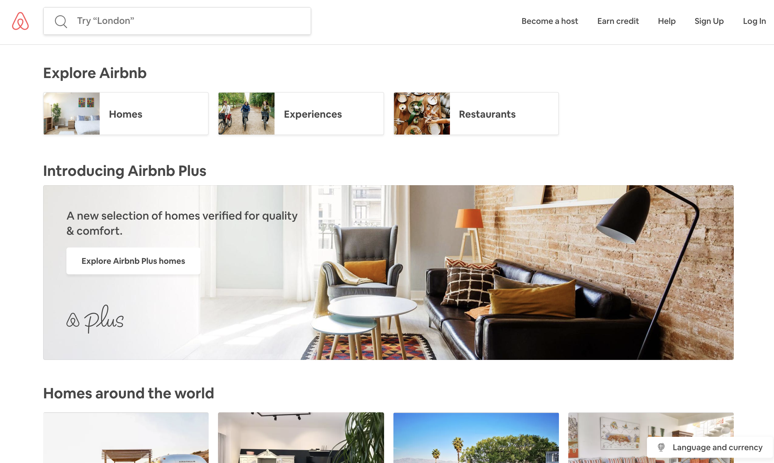
The above-fold experience is dominated here by one big banner: Airbnb Plus. Which is, of course, just a fancier, higher-margin version of the company's core homestay business line. It's a great example of a focused above-fold experience.
The world of clinical trials can learn a lot from this disciplined austerity. Because we work in such a complex field - and have the blessing to be surrounded by so many incredibly intelligent and well-educated teammates - all of us have the tendency to over-educate our visitors in the language that we feel most comfortable with. But by doing so, we end up dropping a bucket of jargon on visitors who may have, at one point, been interested in what we had to say. And this bucket of knowledge causes them to bounce out of our pages quickly. Creating copy that speaks in the language of the patient and ensuring that we've edited that language down to its bare essentials is a quick way to increase our chances at converting our visitors.
Back to Airbnb. As a visitor scrolls down, they are greeted by row after row of beautiful photos of well-curated homes in amazing locations like Casablanca and Barcelona.
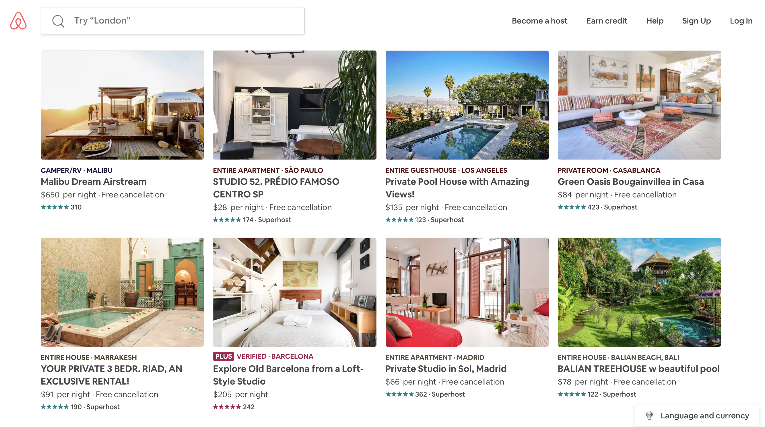
While a grid of photos may seem contradictory to the tactic of focusing on just one core action on a landing page, it actually does the opposite: By displaying a variety of different locations, Airbnb is maximizing its chances of getting a visitor to click on at least one of the options, which then maximizes its chances of converting that visitor into a booking.
And notice too that a search bar follows the visitor as they admire the listings up and down the page. Note that the search bar displays a cheeky call: "Try 'London'". Once again, this is the design team maximizing their landing page real estate by honing obsessively in on the booking conversion action.
The lesson we can learn from this is that displaying a lot of information does not necessary need to distract visitors from a core action. We'll discuss this in some more detail as we dissect one more landing page in a moment, but we do not need to sacrifice showing diverse information as we edit our pages and ensuring that our communication to our audience is concise, informative, and engaging...as long as the information we show ties back to our core conversion action.
But what about the other options at the top?
What other options?
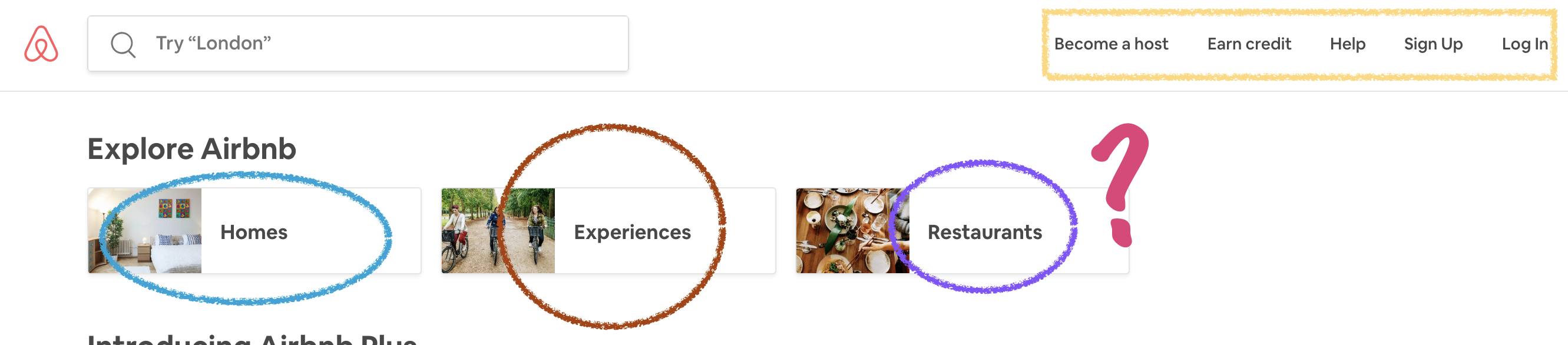
Oh, okay, yes. Those other options. I was getting to those, I swear.
Let's talk about why Airbnb displays a few other calls to action, outside of bookings.
Recently, Airbnb has been making aggressive moves to diversify its business. Core to this strategy is something they call "Experiences"; this is why the team is willing to dedicate a sliver of their insanely-profitable above-fold landing page real estate to introduce the new business lines to their visitors.
But notice that the Experiences call-to-actions do not follow the user around the page, the way the search bar header does. That tells us something about the other calls-to-action that are embedded in that header.
Airbnb's business is not made up of just bookings. To have anything that a visitor to the site can book, Airbnb needs to ensure that it has a great selection of homes in as many locations as possible. Not having supply would pummel demand; it would kill the business.
Repeating for emphasis: Landing pages are high stakes affairs.
And this existential threat to the business is why Airbnb features its Become a host call-to-action so prominently. They want every visitor, every single time, to at least consider for a millisecond becoming an Airbnb host.
Earn credit is a provocative message to a visitor that speaks to every consumer's desire to maximize their purchasing power. Upon clicking it, the visitor is taken to a landing page that prompts them to refer their friends.
Considering Become a host and Earn credit together reveals why the team uses its valuable space to call to these actions: One feeds the supply side of the company's lifeblood business line, and the other feeds the demand side.
As for the other call-to-actions, they're self-explanatory. Help, Sign Up, and Log In are all actions that help users get to the booking action.
The core lesson from this navigation bar that can inform our recruitment pages is simple: Only display what ties back to the core conversion. In our experience, recruitment landing pages benefit greatly by only showing one link in a navigation bar like this one: A quick link back to some method to contact the study team.
But if you have data that indicates offering links to an FAQ or to more information about the condition and treatment you are researching could help increase your chances of converting a visitor into a lead or a pre-screened candidate, you should definitely display those options. Our guidance is simply that you interrogate closely each and every link you show a visitor that is not directly tied to getting them further down the recruitment funnel. Be ruthless in your edits and make decisions wherever possible with data.
But everyone knows Airbnb! It's easy for them.
Fair point, well made. Airbnb is a hulking behemoth of a company now. Valued at $31B, they are a long way from their humble roots of renting out the founders' air mattress in a cramped San Francisco apartment.
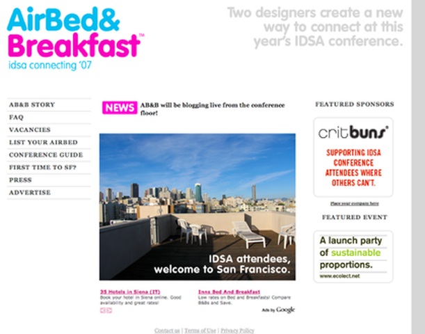
Good news is that we have access to their first-ever landing page! So let's take a quick look at it.
A few things stick out here.
One is that the page, even back then, optimized for that one action: Booking.
In this case, it was even more specific an action: Booking an air mattress in the founders' apartment for folks traveling to San Francisco to attend the Industrial Designers Society of America's 2007 conference.
Everything on the page is designed to help a conference attendee decide to stay on a couple of strangers' air mattress. The headline of the page specifically mentions the IDSA conference; in fact, the conference is mentioned multiple times above the fold.
But the team knew that staying in a stranger's home was too new a concept for almost everyone. One can see the way they tried to address the newness of their business model by designing for trust.
For instance, the landing page spends significant space to feature a sponsor (thereby establishing social proof for the just-born company. They even display a Featured Event, which helps the site appear more significantly tied to the conference, without having to have the event be an official sponsor of the page.
And of course, the team worked the easy, more traditional angles, too. They feature an FAQ on the sidebar, as well as their founding story ("Airbnb Story") and a link to their early press (more social proof).
The parallel to the world of recruitment is quite obvious in this case. In the same way a clinical trial is still an exotic concept in the mainstream, so too was the concept of sleeping in someone's living room whilst visiting a city for a conference.
Airbnb had a lot of important information that needed to get conveyed to convert anyone to a booking. And yet, the landing page remained remarkably concise and, as a result, the message and core conversion action were left unambiguous to any visitor. All they needed was to get some small segment of their website visits to convert into a lead...just as we in clinical trials need just a small sliver of a conversion rate from visit to lead to make our recruitment funnel work.
And the team behind this first Airbnb page had the wisdom to know that there was little chance of conveying all they needed to convey to get a visitor engaged. It would take too long, require too many words and pictures; the visitor would almost certainly drop off if Airbnb tried to plead its case in full right at the top of the page.
So, they relied on social proof to quickly dismiss some early concerns. And the same concept holds true for recruitment: It's been our experience time and time again that a million science-y words and a thousand cool facts about research have just a fraction of convincing power as that of a patient vouching for your team or research.
If there is any opportunity for you to use social proof within your page - from a patient who lives with the condition you are studying, or from someone on your team who can vouch for the safety of the treatment, or a quote from press - use it, and put a face to the quote if at all possible. After all, th visitors to your landing page are going to be motivated folks living with some medical condition - or motivated folks who act as caretakers for those living with the condition - who do not have a lot of time or patience for medical jargon. Provide them with some social proof of your work, and they will feel much more comfortable, much quicker than they would have after reading a long scientific journal entry about your research.
Let's talk about a landing page for a specialized product.
All that ink being spilled, it's still the case that Airbnb is a massive, mainstream product. And the nature of what they sell is very different from a clinical trial.
So let's look at how one team sells a product that is esoteric like a clinical trial. Let's talk about Moz's landing page.
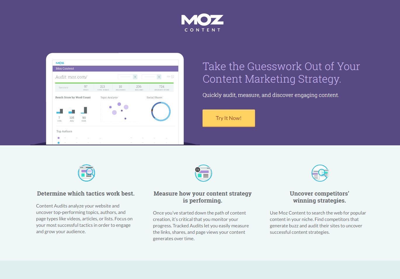
Moz sells a pretty specialized product: They build tools to help content marketers measure and optimize their work. For most people, content marketing is a completely foreign concept. And yet, looking at the above fold explainer text, anyone can understand exactly what Moz is about, and for whom Moz is built.
The Moz team breaks down a complicated product (I work with the tool daily, so I know intimately just how deep their product is) into bite-sized chunks of information that are eye-catching (thanks to the icons) and immediately understandable. The team does a great job at each opportunity in educating their visitors: The language is written such that even those who have never worked in marketing can understand the product's value proposition, and each bit of explainer text is headed by a bold, catchy headline.
We see time and again that clinical trial landing pages are too quick to get to the education component above the fold; this ends up burying potential calls-to-action. Every landing page in the clinical trial field can learn from the way Moz breaks down the most pertinent information for its audience. Dividing up the points, making them quick to read and immediately comprehensible does wonders for any landing page's copy.
Thanks to the strong editorial work, the Moz team is able to display a big, bold button as its core call-to-action. It cannot possibly missed. We've all seen many recruitment landing pages that bury their pre-screeners or contact capture modules at the bottom of the page (or, worse still, in a subpage that is difficult to navigate to). Bring that call-to-action up, make it bold and obvious and enticing, and your funnel will thank you for the effort.
A few screenshots of other pages that are also awesome.
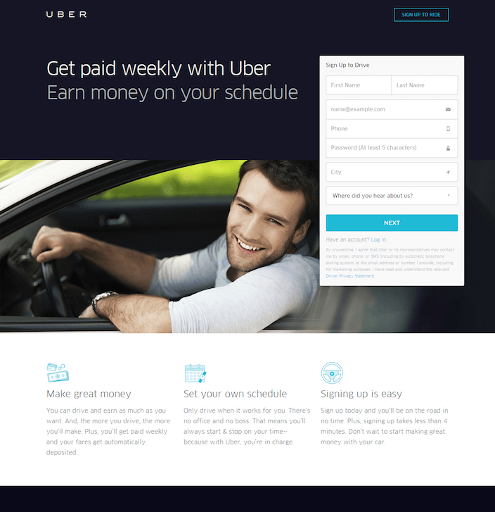
Uber knows that the core of its business depends on getting great drivers. They make it super easy for any potential driver to leave their contact information, and break up the value proposition in bite-sized chunks. We've designed landing pages in this style before, and have seen really strong visit-to-lead conversion rates of 3-4% on them.
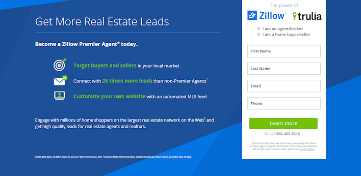
Same principles here. Zillow recruits for agents by making it super easy for anyone to leave their information. We see that big contact capture form appear again, and another relatively esoteric concept broken down into digestible pieces.
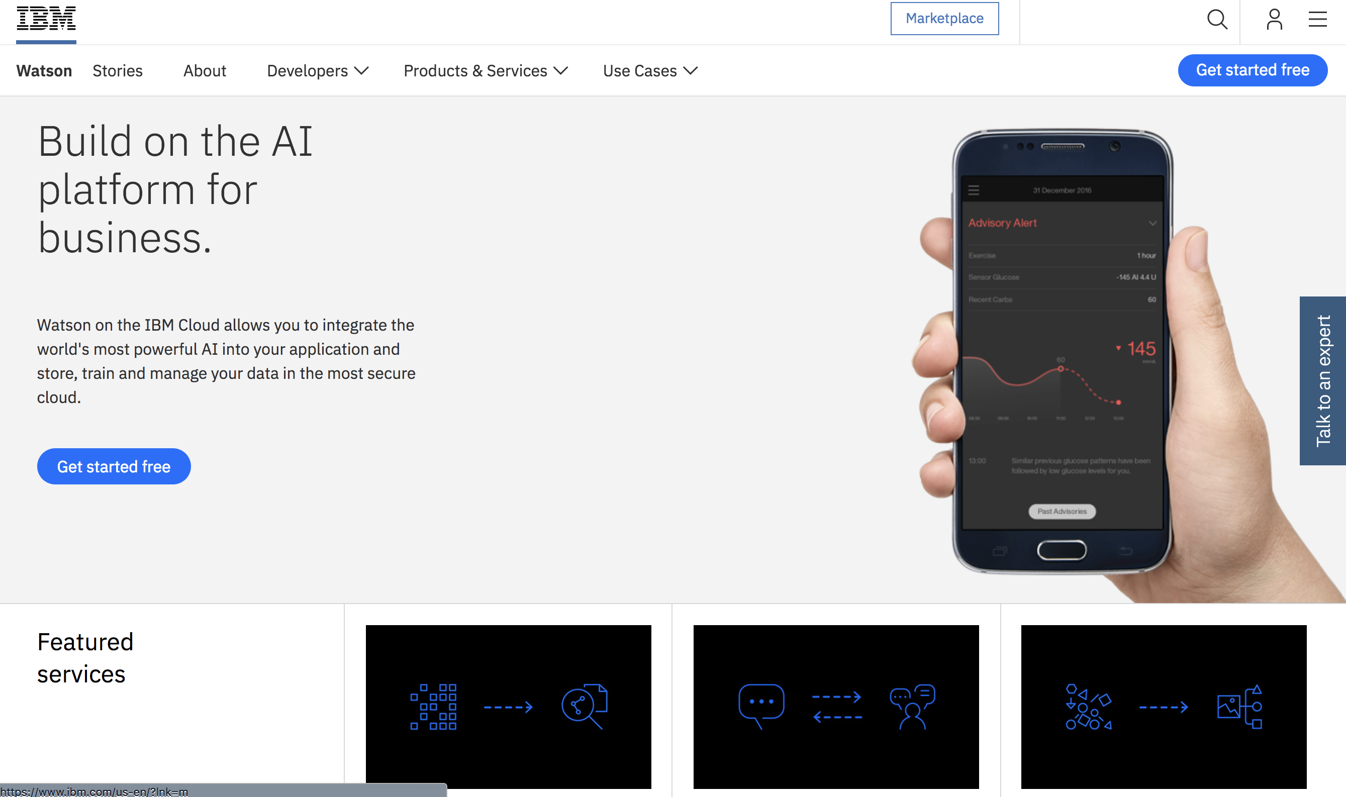
Finally, here's the IBM Watson for Developers page. Few concepts are as out-there as machine learning and AI, but the Watson team does an admirable job in breaking down the concept in language appropriate to their audience.
Note that the audience here is developers. We see that the language is catered specifically to coders: Mentions of easy integration, powerful capability, and data management. All key points for a developer.
In the same way, clinical trials can address their audiences in the language they speak, and present them with the potential value of the treatment. If IBM can break down Watson's immense capability this concisely, any clinical trial can do the same.
Here, we see a different call-to-action: A big blue button that pops to the eye, offering a free start. But once a visitor clicks this button, they are transported to...
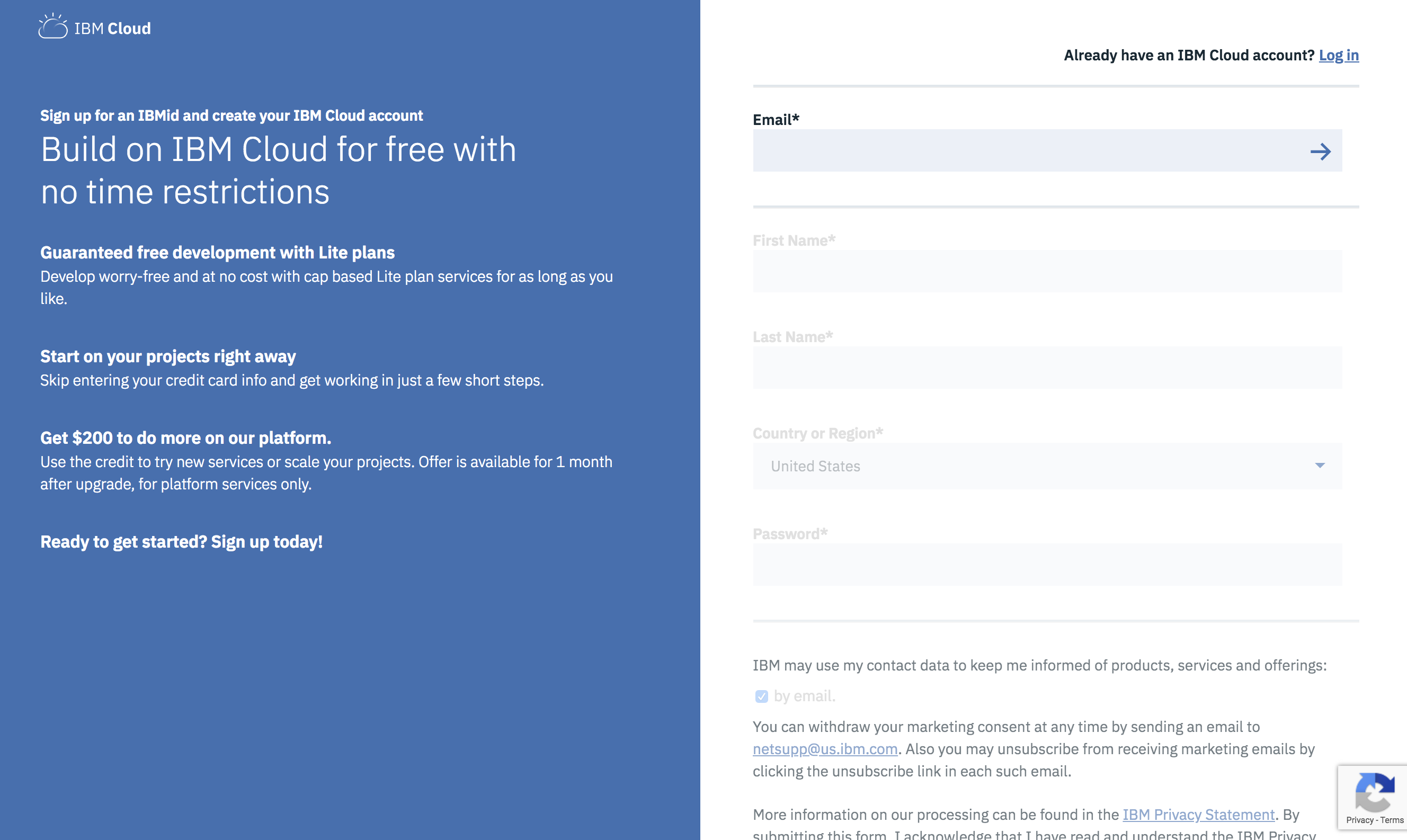
...yup. A big contact capture module, with some more information broken out into bite-sized bits.
Conclusions
The biggest - and even the youngest and scrappiest - tech companies know that a landing page is not a place for the Great American Novel. Designers have learned from decades of landing page evolution on the internet that the most important principles are resisting the temptation to overload a visitor with information and allowing that visitor to quickly find an unimpeded path to a target conversion action.
If you'd like to learn more about the tactics we use every single day at Clara to optimize landing pages for clients and our own internal efforts, you can check out my breakdown of the seven most important landing page optimization tactics here.